Fintech savings app with focus on simplicity.
Quick SUMMARY
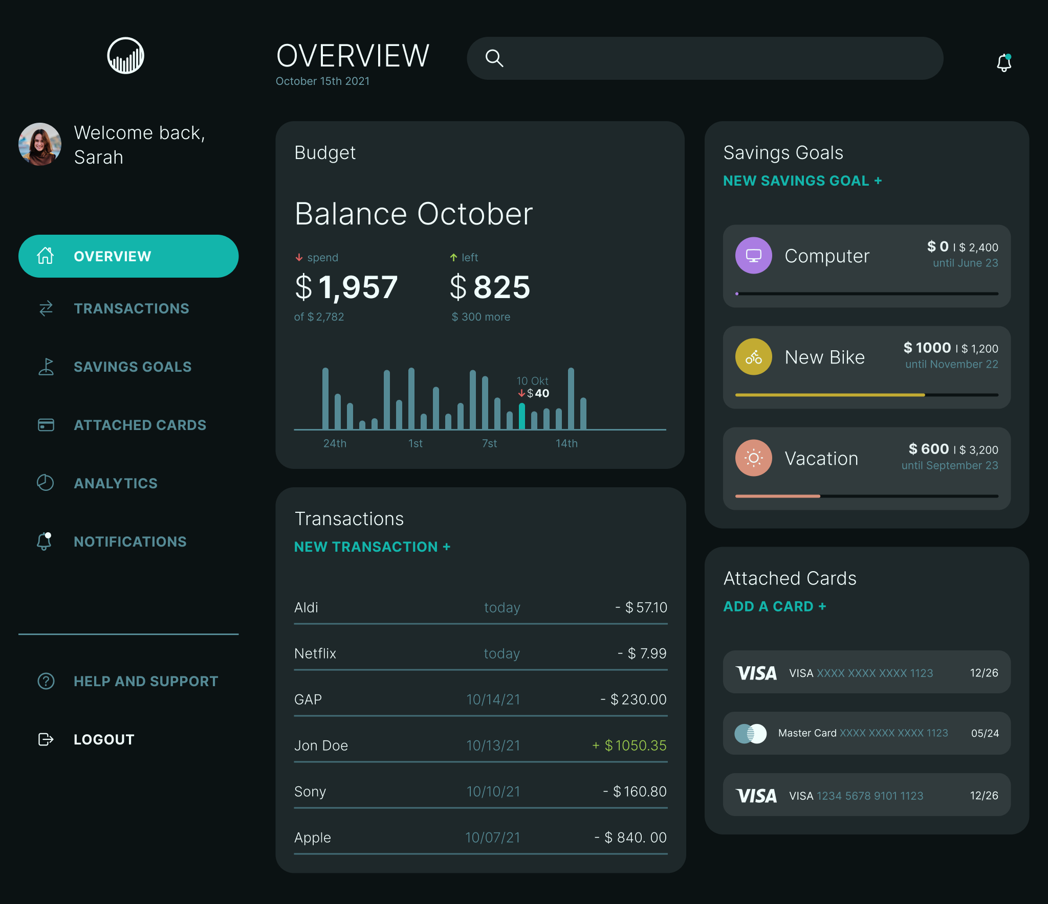
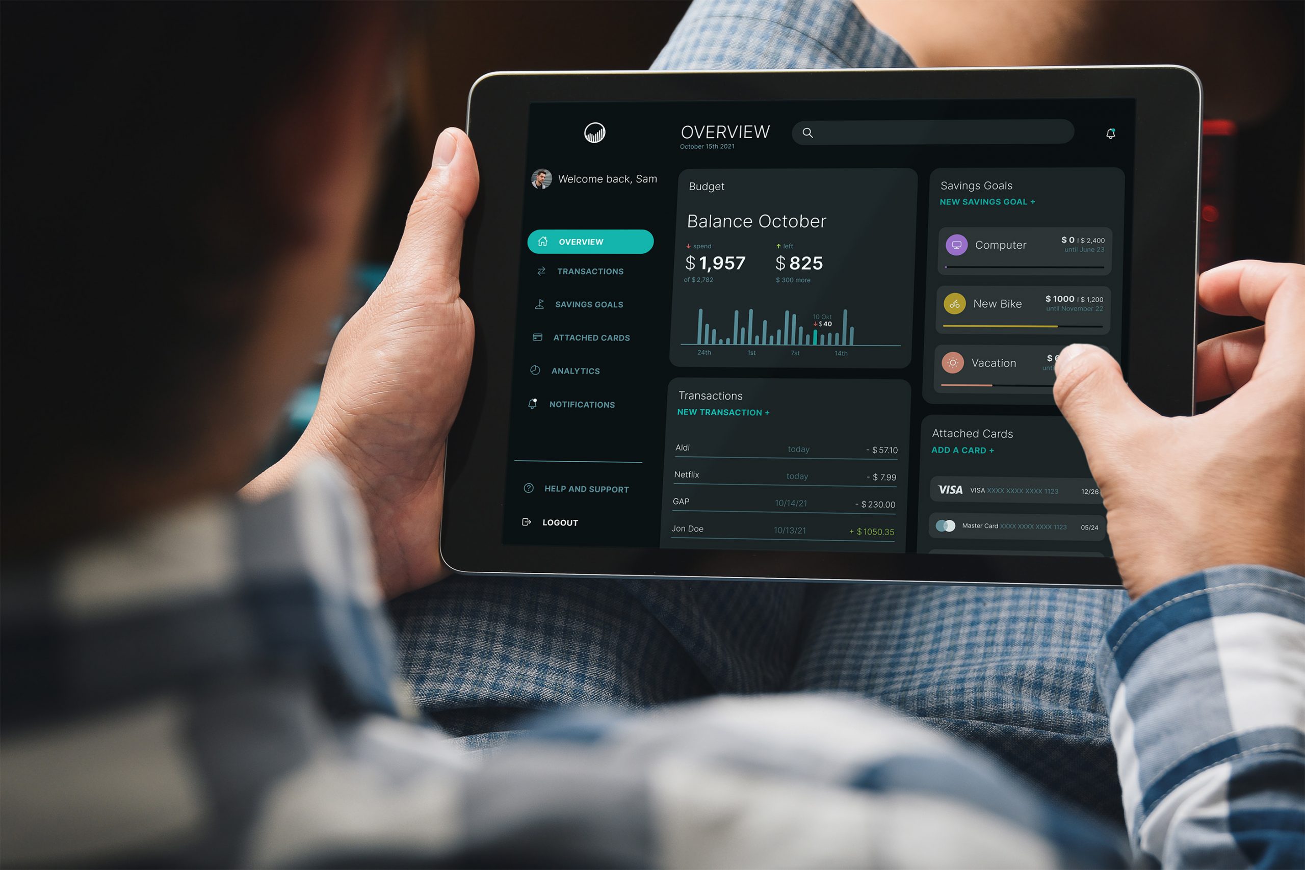
When I took the course at CareerFoundry, I was assigned the task of designing the UI and UX for a fintech app. At first, I thought, "not another fintech app," but I challenged myself to create the simplest experience possible for setting up a savings goal. The flow and visuals were designed to express this simplicity. Lacking real world impact, I concentrated on the beauty of the design. I relished this rare occasion.
The Process
practice makes perfect
research
• Identifying a pain point
• Competitor analysis
• Defining main objective
Ideation
• Creating user flow
• Creating wireframes
• Rapid prototyping
Testing
• User testing with prototype
• Iterations based on feedback
Final Design
• Logo design
• Styleguide
• Screen design
IDeation
The user flow
I created a user flow based on given needs of the user. I did not identify the needs myself by conducting user surveys, as the emphasys of this exercise was on the creation of the user interface. The predefined needs are:
As a user, I want to see a dashboard of my finances clearly and visually, so that I can see how much I am spending on what at a glance.
As a money-saver, I need to be able to input information on the money I am receiving and spending, so that I can see an overview of my finances.
As a user, I need to be able to tell the app what my savings goal is and how long I have to reach it, so that I can save accordingly.
Testing
Usertesting
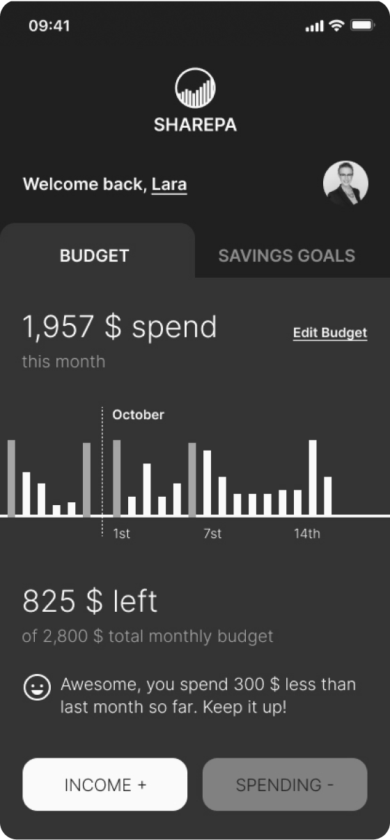
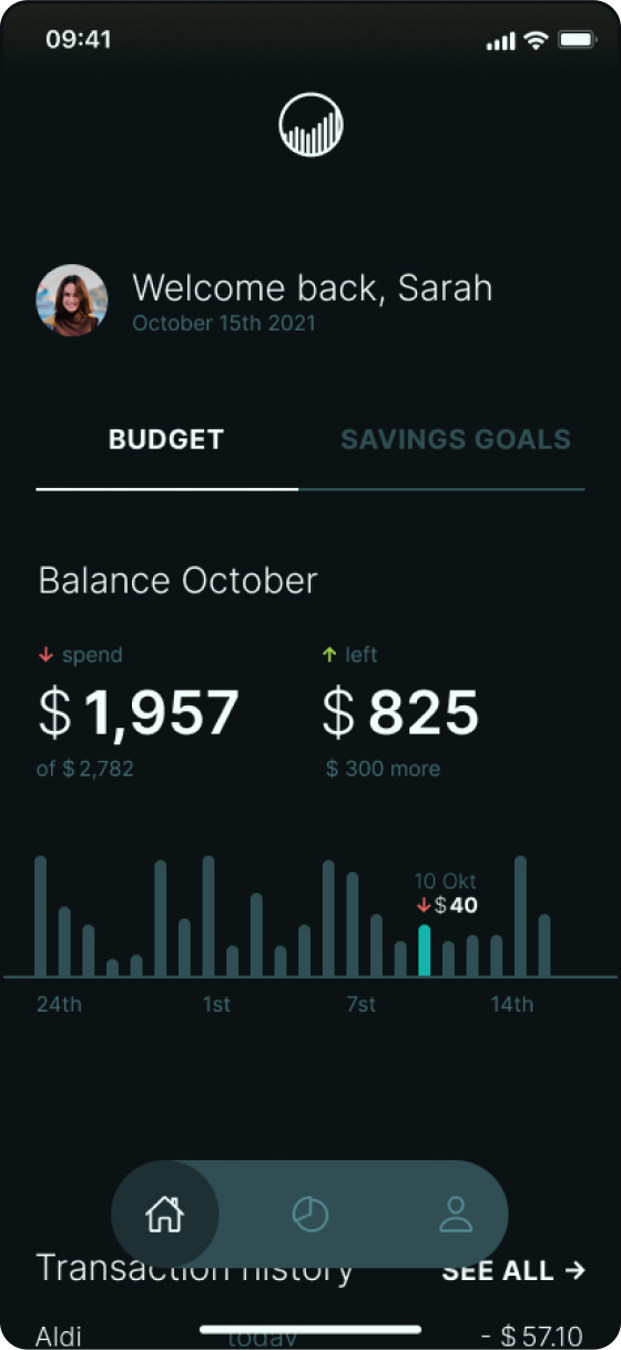
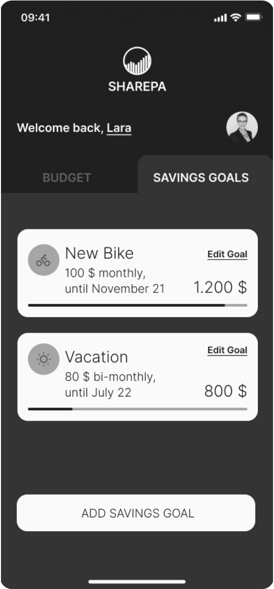
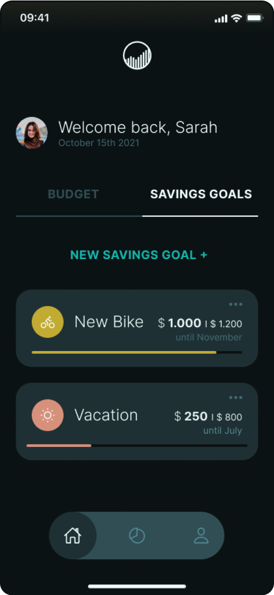
After I was satisfied with the mid-fidelity wireframes, I tested them with a prototype by asking participants to set up a new savings goal. I am glad I conducted the testing because I found several critical issues. The screen that caused the issue is on the left, and my fixed high-fidelity wireframe is on the right. Try moving the slider.
Issue NO. 1
One participant had trouble identifying the two tabs at the top of the dashboard as clickable areas.
Before/After
Issue NO. 2
One participant wanted a way to go back within the savings goal setup flow without canceling the whole process.
Before/After
Issue NO. 3
One participant had trouble finding the "Add Savings Goal" button because it was located too far down on the screen.
Before/After
Final Design
The finished prototype
Budget and Savings Goals
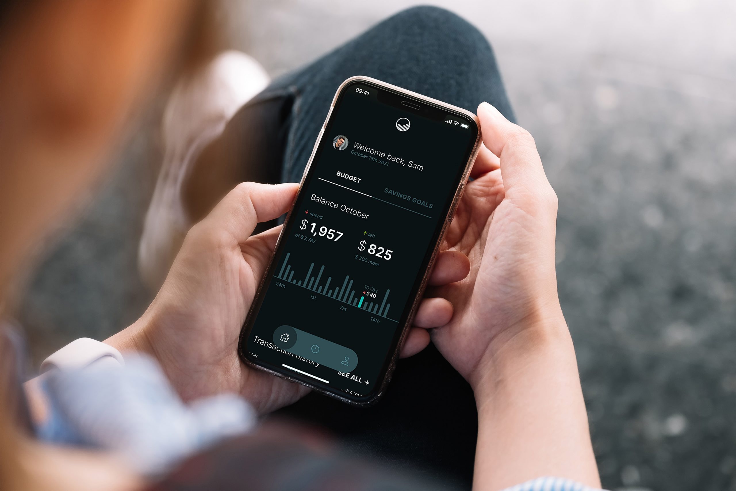
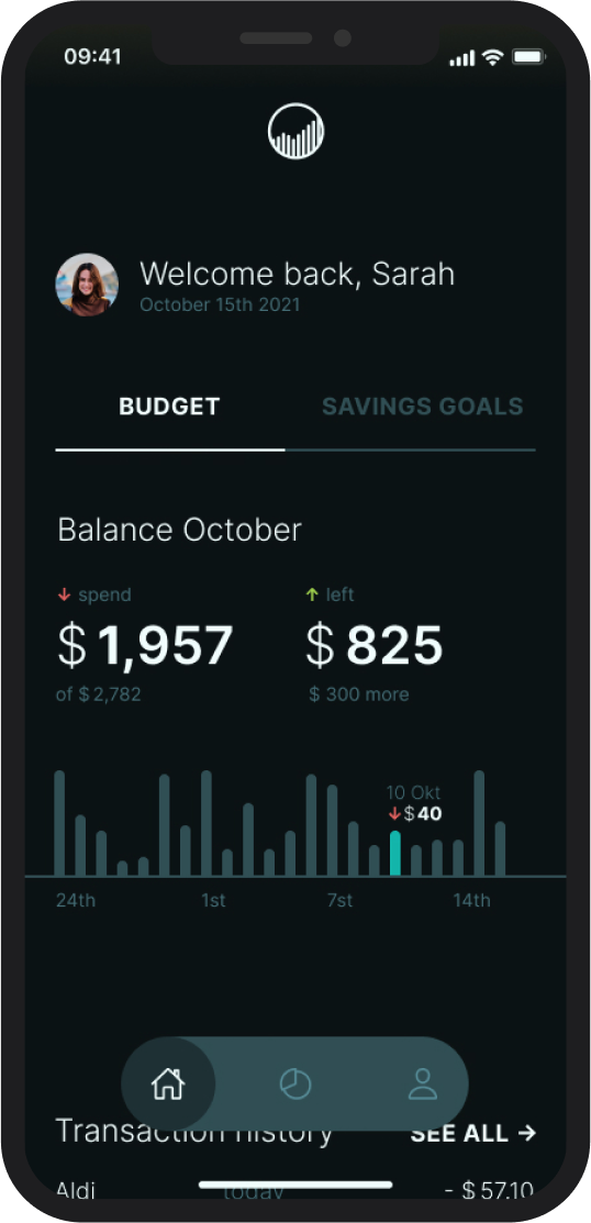
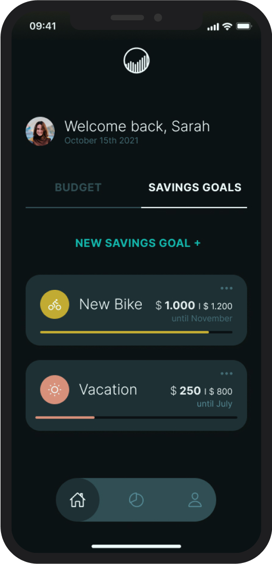
With Sharepa, the budget and savings goals have equal importance, which is why the user can toggle between them on their home screen without having to leave.
Creating a new savings goal
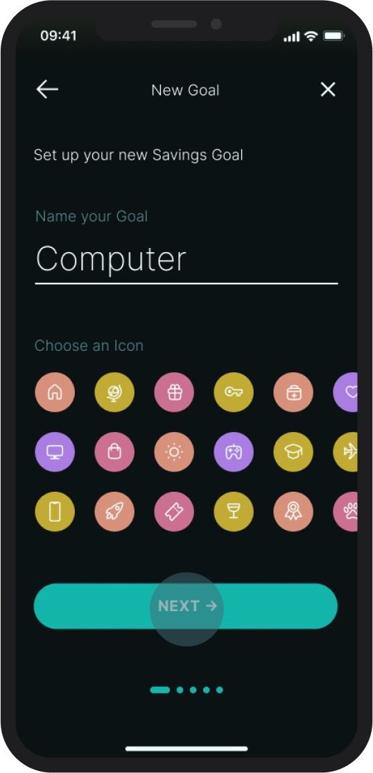
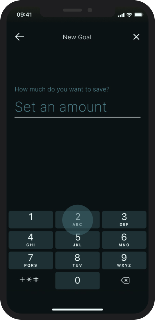
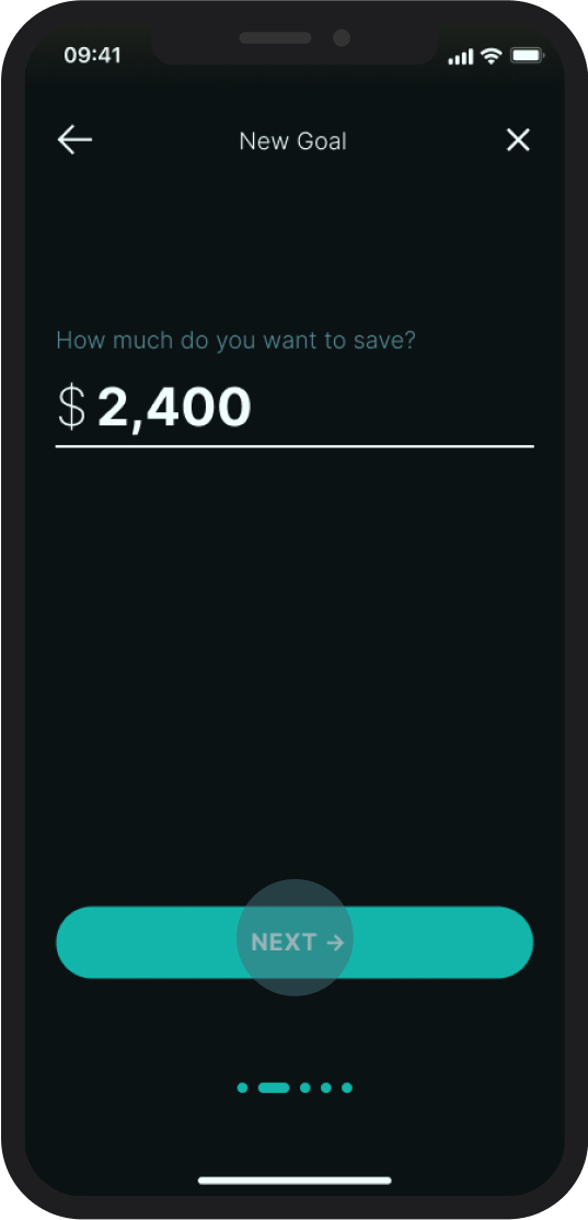
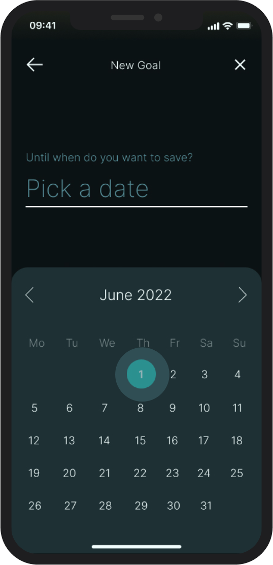
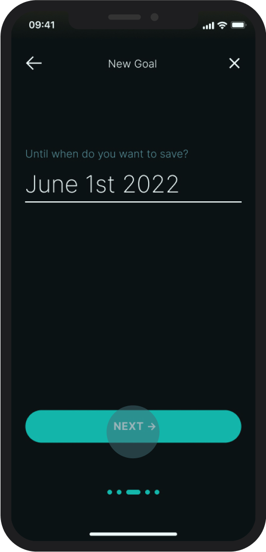
Sharepa makes setting goals easy by guiding the user through the setup process one screen and one piece of information at a time.
Overview screen
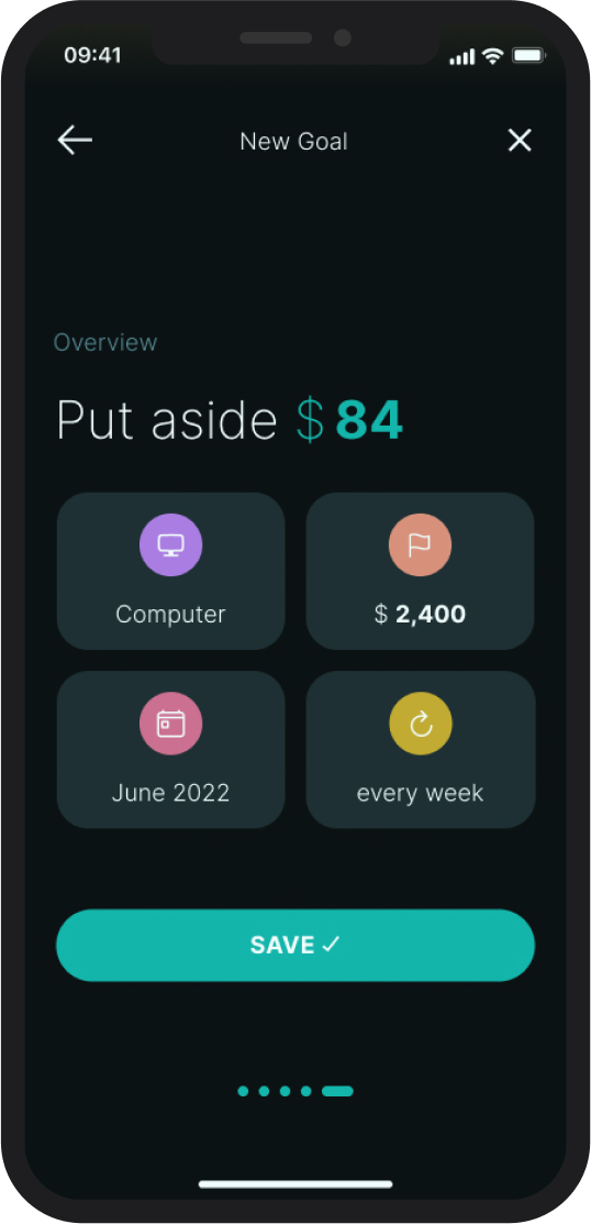
After setting up a new savings goal, the user gets to review the new goal before implementing it. A simple click on any widget of the new savings goal takes the user back to the setup screen to make desired changes.
Lara Osborne 2023