
Small Business Health & Safety:
A redesigned magazine for workplace well-being

Quick SUMMARY
It's merely a play of thoughts - but that's what makes it interesting. Freed from restrictions, I was able to create a fresh, surprising, and colorful magazine. The layouts are based on the new style guide of AOK, which was introduced in 2022. The occasion was a tender for corporate customer media.
© AOK
Elements
Creating a distinct look
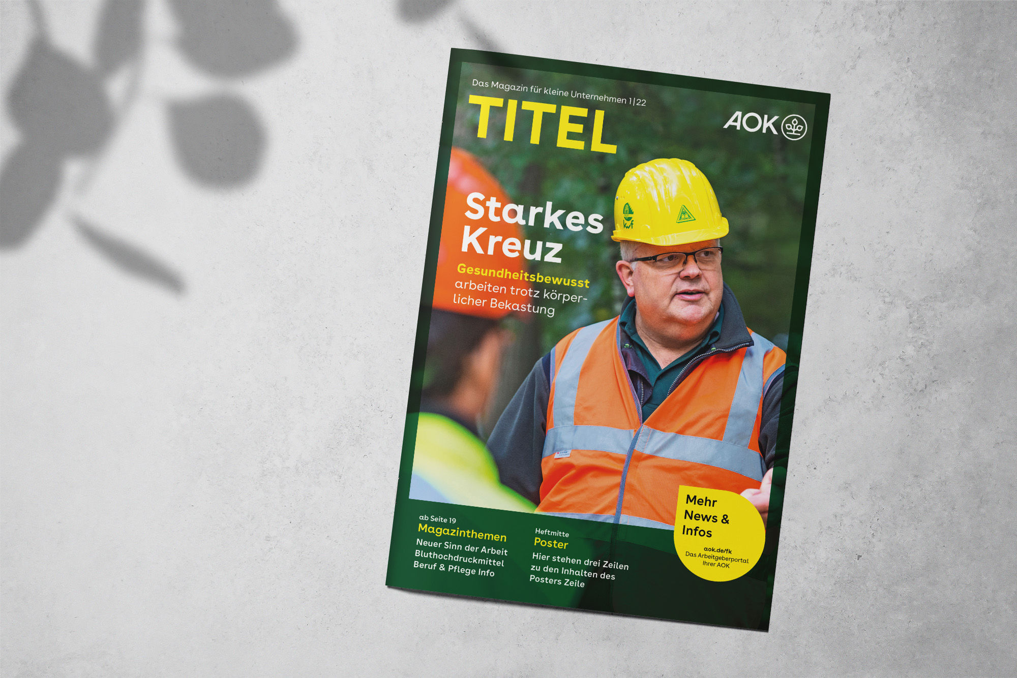
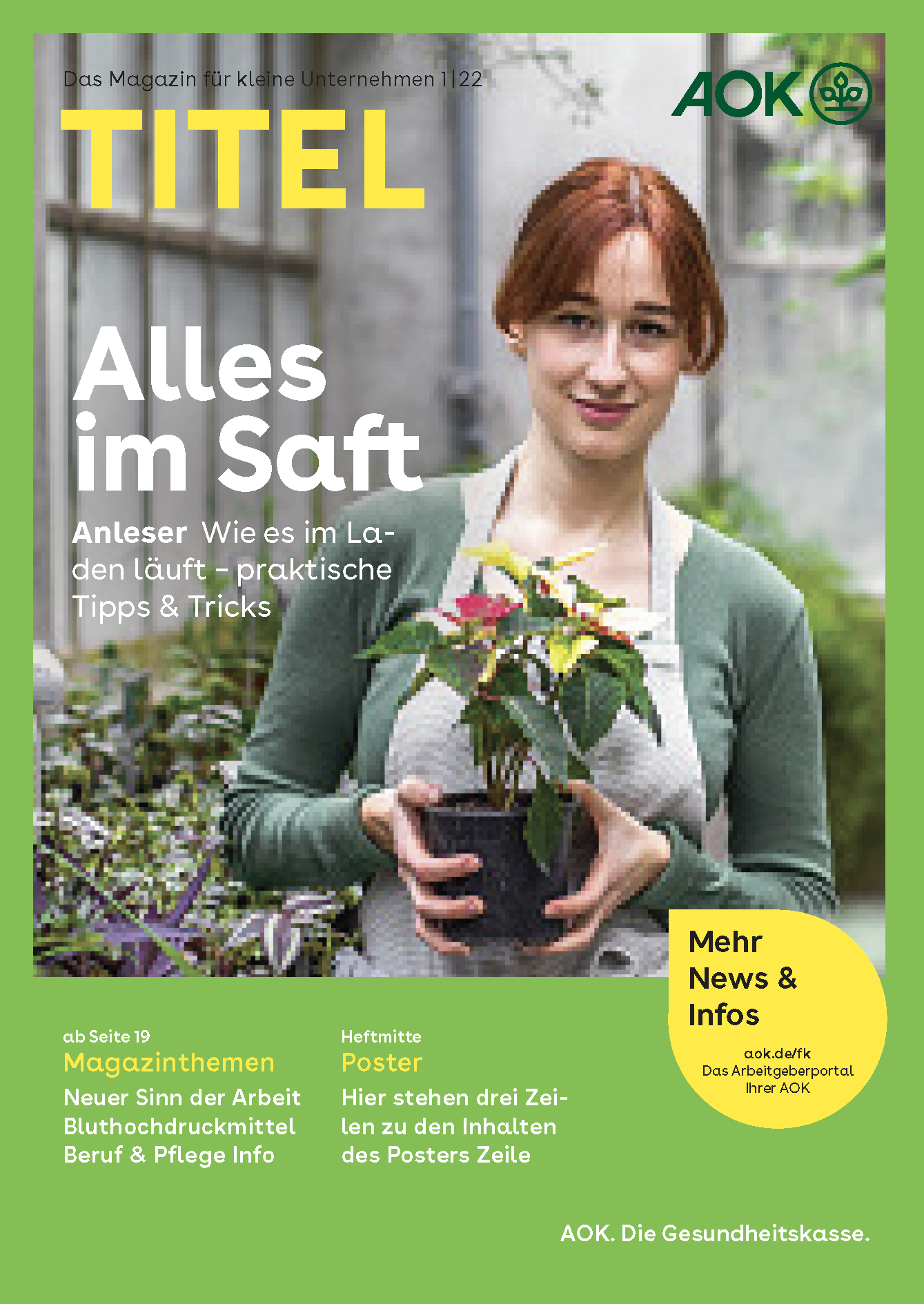
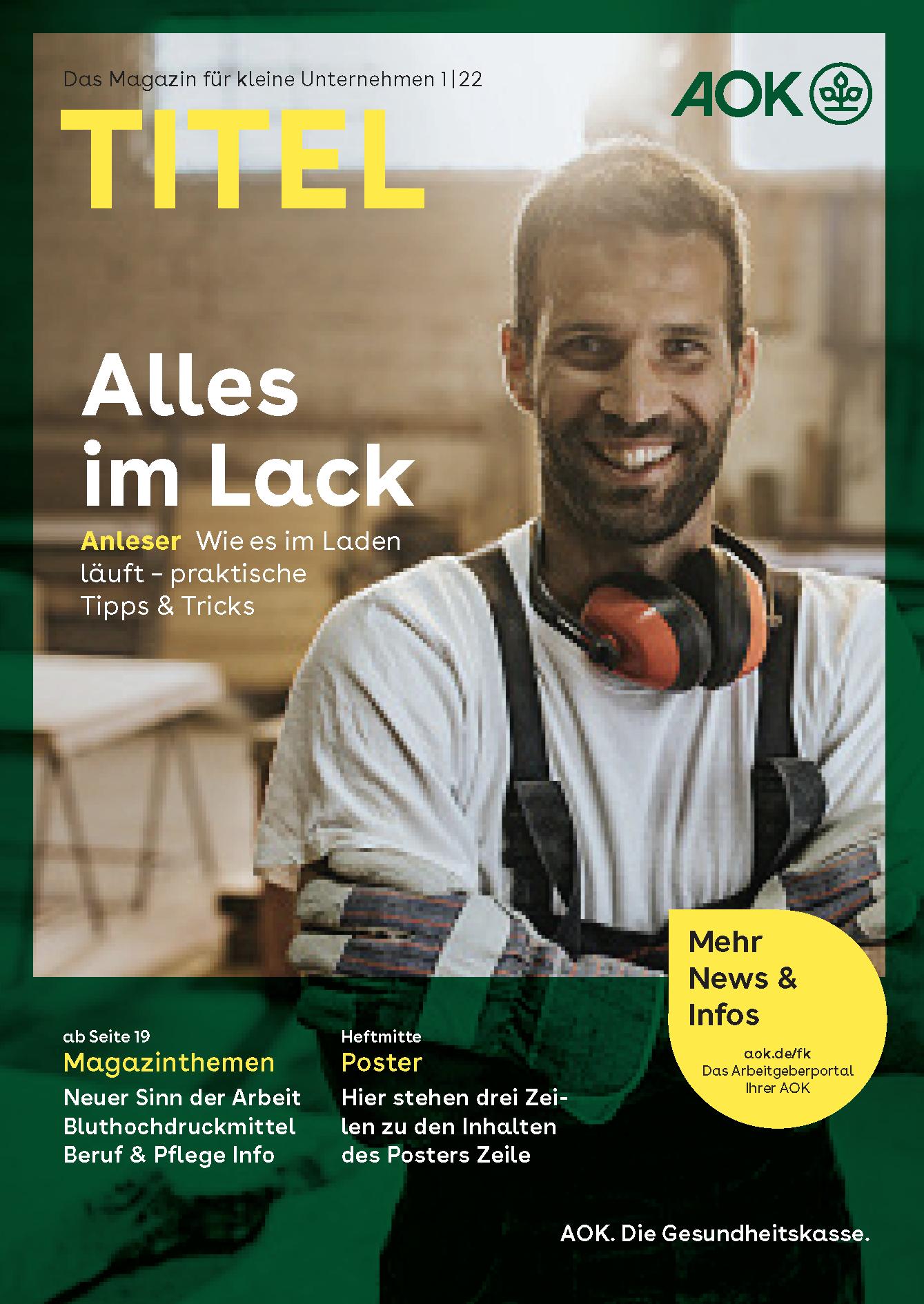
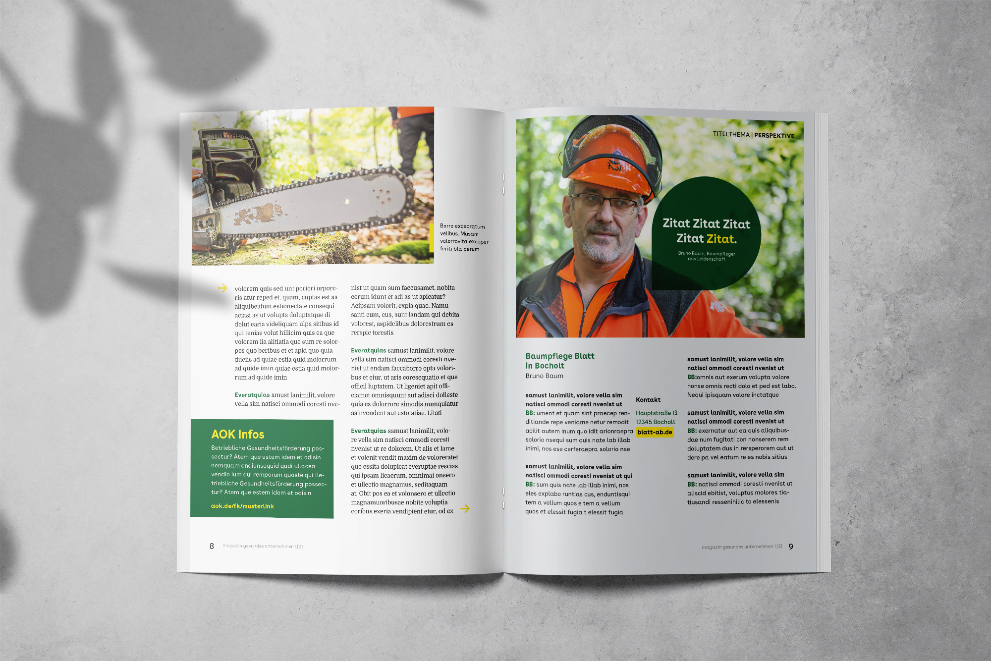
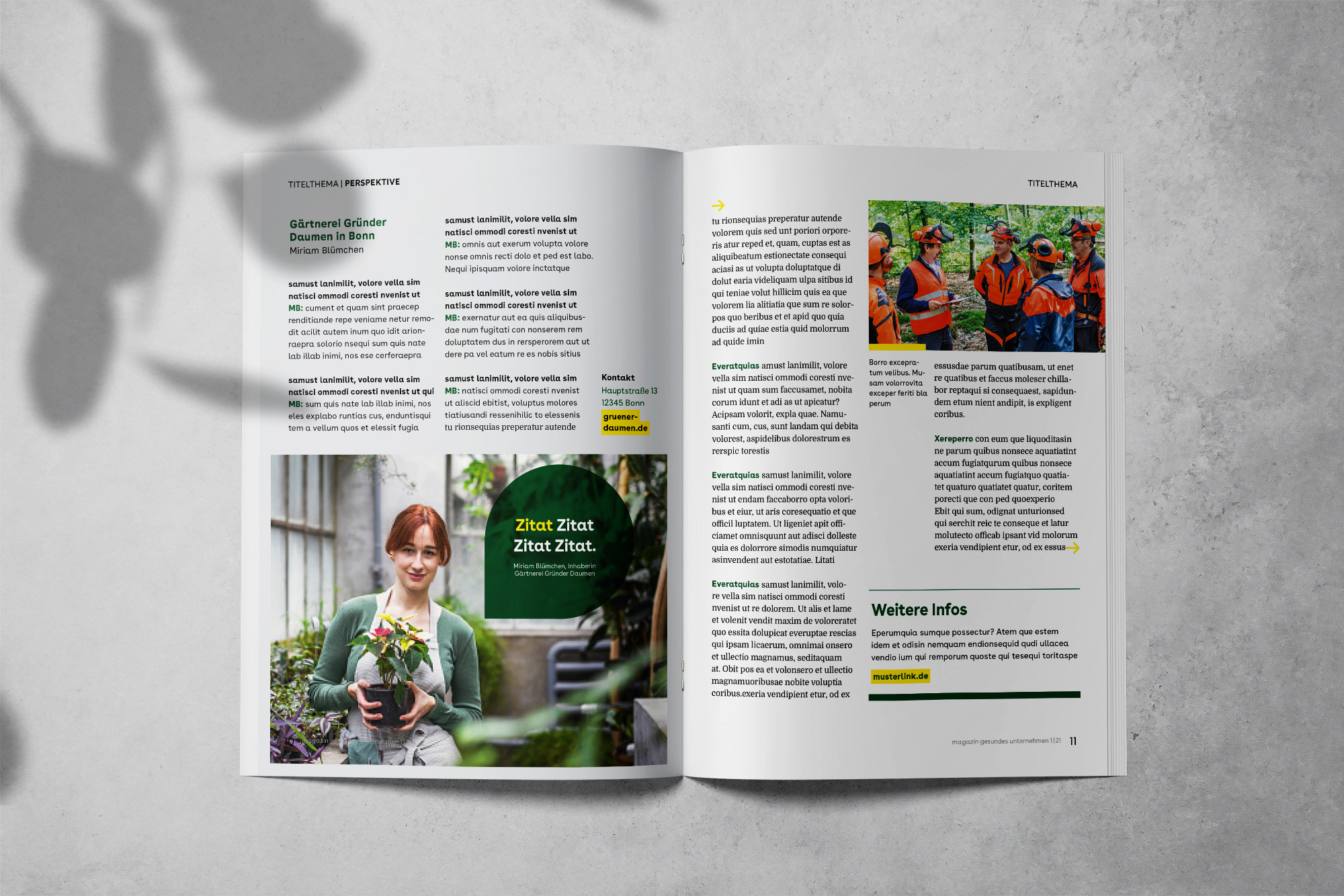
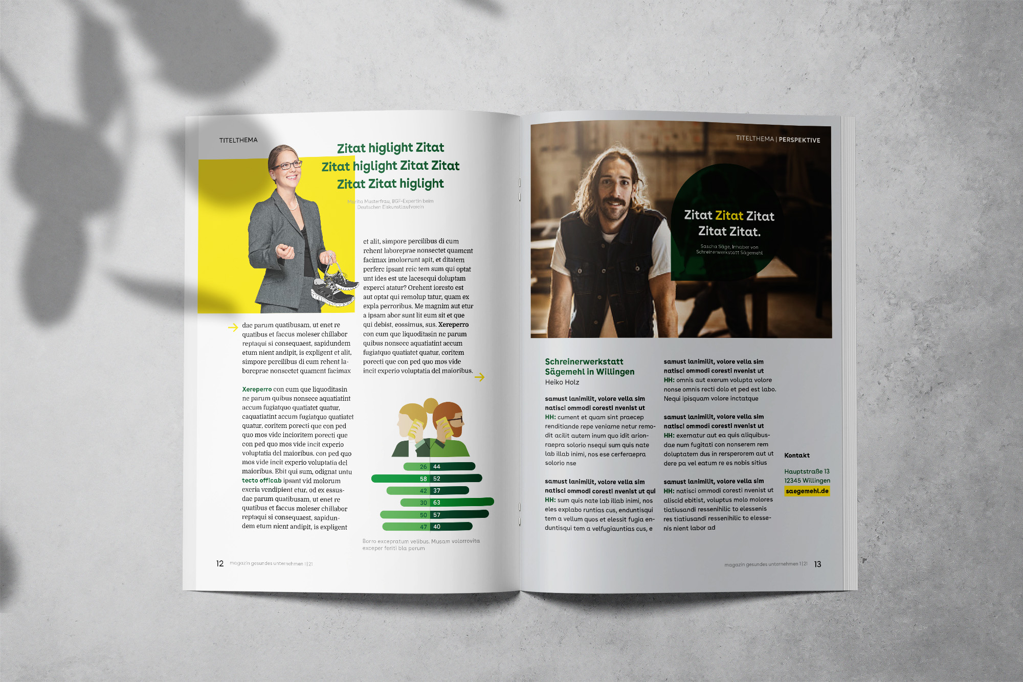
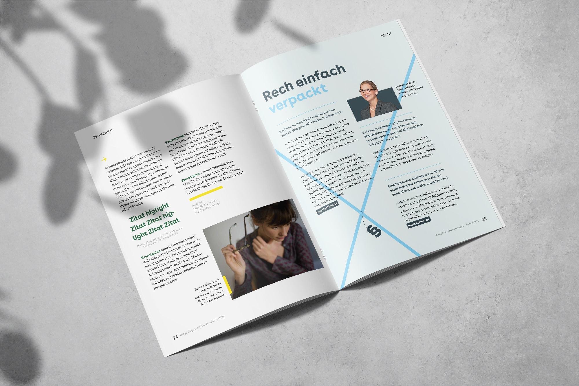
As the target audience of the magazine were small and mid-sized businesses, I aimed for a more modern and casual look. The new magazine was not designed to be read by CEOs of the top 500 companies, but rather by small business owners who need practical solutions for the challenges they face in their daily operations. The magazine should be both enjoyable and informative, providing easy-to-understand and actionable information.
Focus
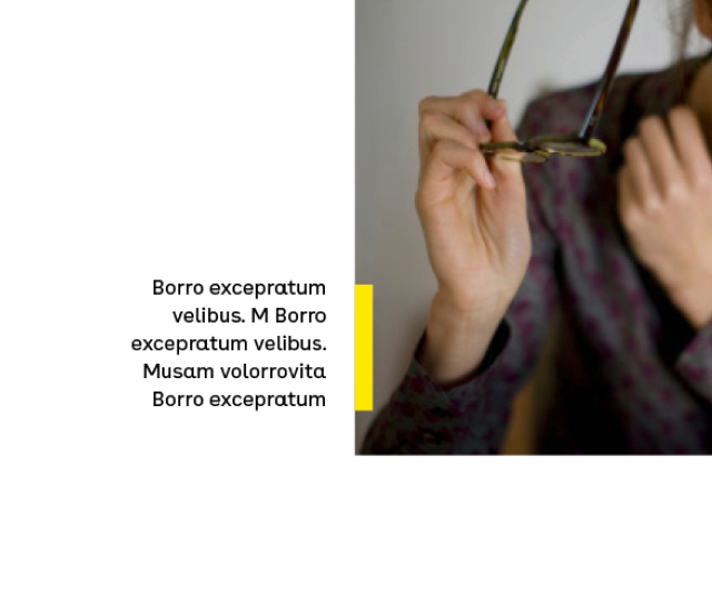
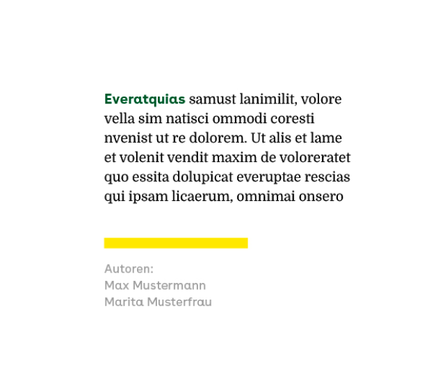
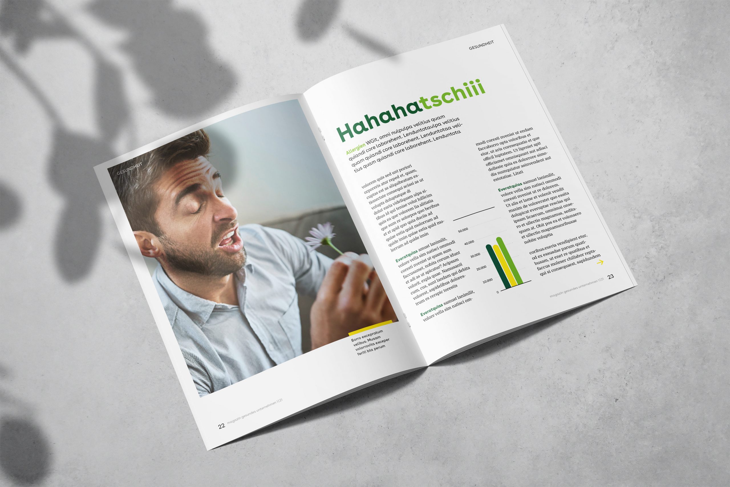
Yellow elements are used to direct the user's attention to small details that might otherwise be overlooked. These pops of color also help to brighten up otherwise dark images.
Readability
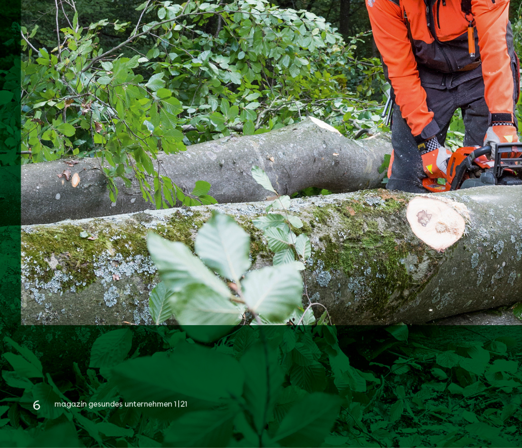
To enhance readability on full-page images, I had the opportunity to reuse the frame that is also providing structure to the cover page.
Framing
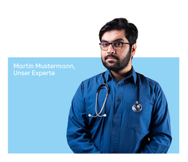
Portraits of experts are often framed by brightly colored squares that display the person's information.
Layout
The magazines flow
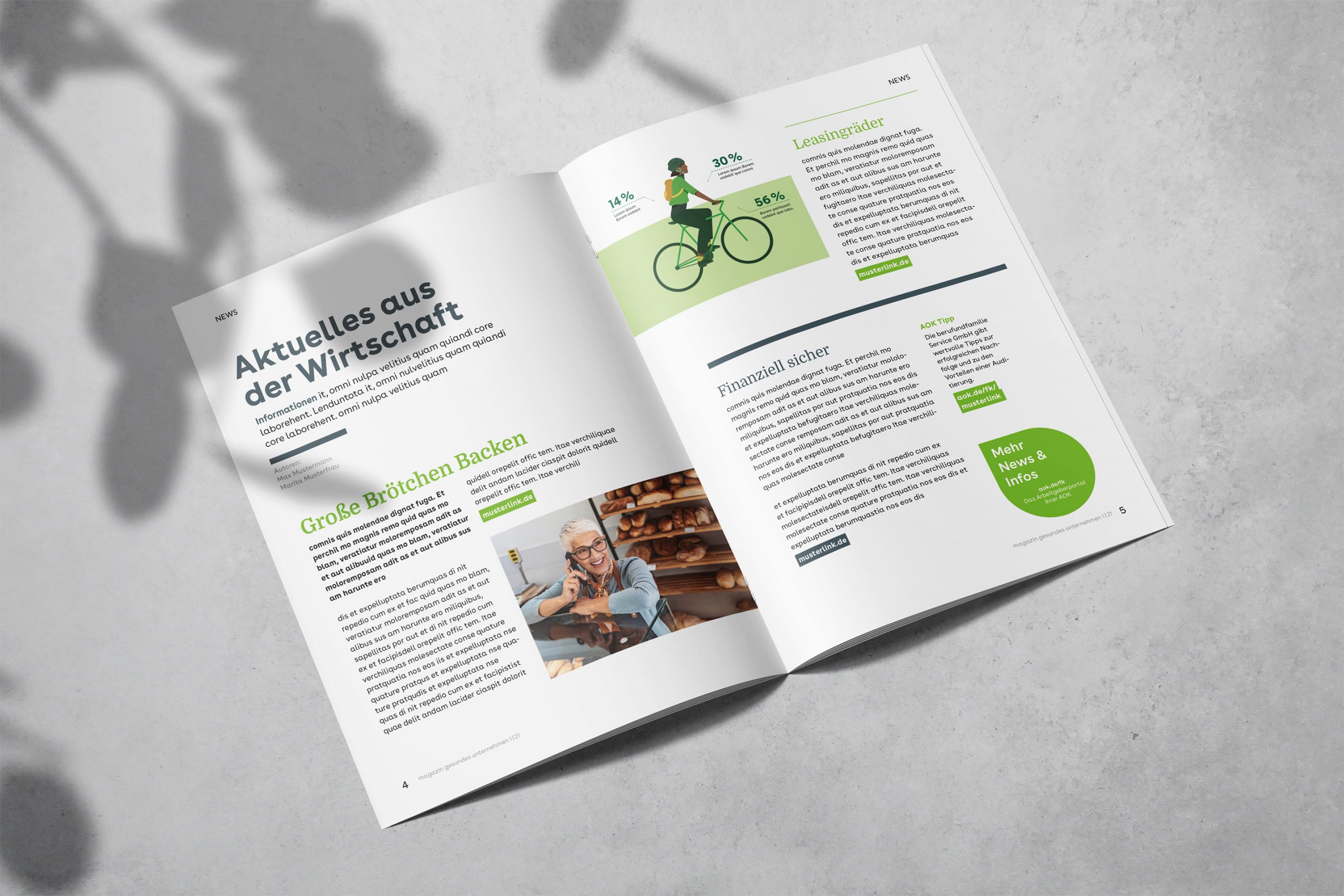
I wanted the magazine layout to have a pleasant flow. Loud, exciting sections alternate with quieter pages where the eye can rest. It was also important to create information islands that convey essential information, even if the reader doesn't feel like reading the entire section at the moment.
Lara Osborne 2023
